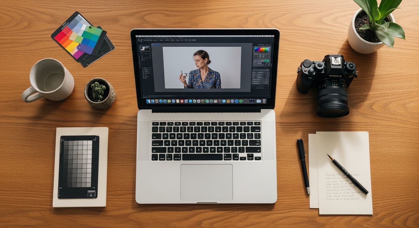
Introduction
The camera captures the moment. The edit creates the story.
Every great fashion photograph you have ever stopped to admire — the ones that feel like they belong in the pages of a luxury magazine, the ones that make an ordinary outfit look extraordinary, the ones that seem to carry an entire mood in a single frame — were shaped as much in the editing process as they were in front of the lens. The edit is not an afterthought. It is where the vision is completed, where the aesthetic identity is fully expressed, and where a technically competent photograph becomes something genuinely, memorably beautiful.
In 2025, the photo editing tutorial looks generating the most admiration in fashion photography are those that feel simultaneously intentional and organic — edits so well-executed that they appear to be simply how the light fell, simply how the colour was, simply how the moment existed. The most powerful editing is always the kind that cannot be seen — only felt.
Whether you are a fashion content creator building a distinctive visual identity, a photographer developing a signature editing style, or simply someone who wants their photographs to communicate the same beauty and intention as their personal style, these thirteen photo editing tutorial looks will give you the knowledge, the direction, and the practical guidance to transform your images into something genuinely worth stopping for.
1. The Warm Film Tone Tutorial
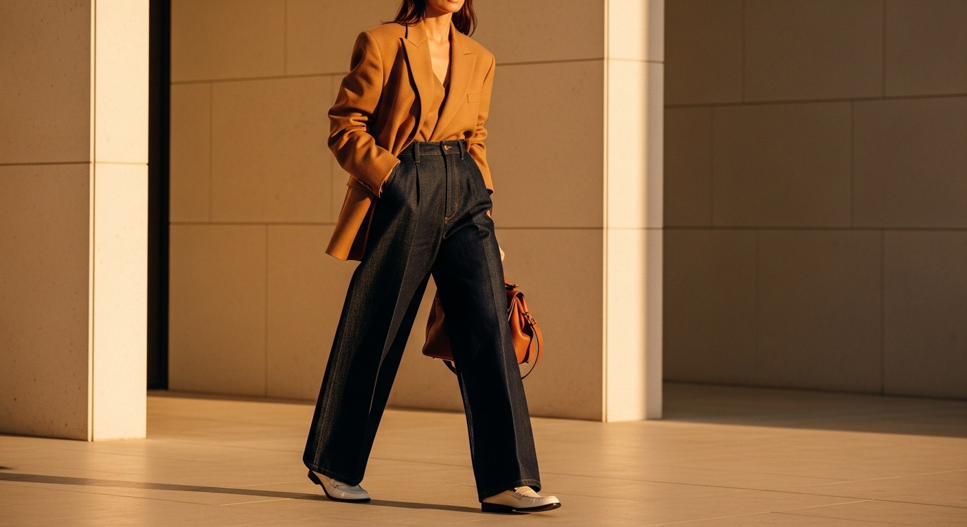
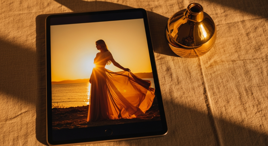
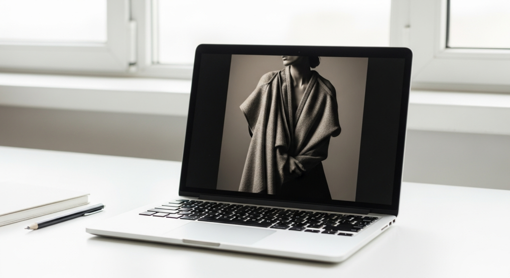
The warm film editing look is the most enduringly beloved and most widely saved photo editing aesthetic in fashion photography — inspired by analogue film stocks from the 1970s and 1980s, it transforms any digital image with grain, lifted shadows, warm highlights, and a slightly faded quality that makes photographs feel nostalgic, intimate, and deeply human.
Styling Tip for the Edit: Begin by setting the white balance warmer — increase temperature by approximately 200 to 400 units in Lightroom. Lift the shadows using the tone curve by raising the bottom anchor point to create the characteristic film fade. Add warmth to highlights by shifting the highlight hue toward orange-yellow in the HSL or colour grading panel. Apply grain between fifteen and twenty-five percent with medium to large size for the most organic, film-like texture. Finally, reduce overall saturation by five to ten percent for the slightly muted, faded colour quality of genuine film.
For fashion photography, the warm film tutorial look is most beautiful with outfits in earthy, warm tonal palettes — camel, terracotta, warm cream, and denim all photograph extraordinarily well within this editing aesthetic.
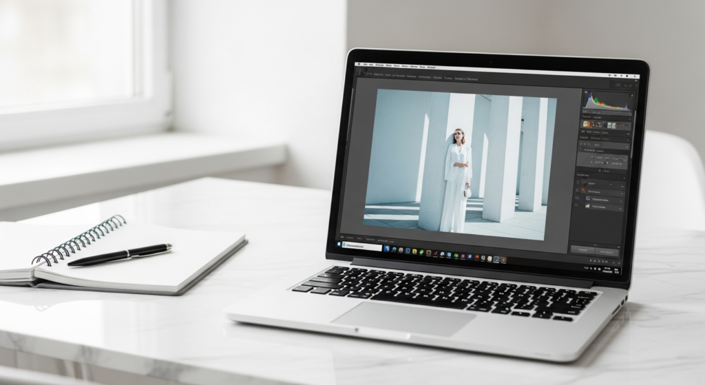
2. The Clean Bright Editorial Tutorial
The clean bright editorial photo editing look is the aesthetic of premium fashion magazines and luxury brand campaigns — airy, precise, and possessed of a luminous clarity that makes every image appear both effortless and professionally polished. It is the editing style that communicates quality, intention, and genuine aesthetic intelligence in the most immediately accessible way.
Styling Tip for the Edit: Raise the exposure and whites to create bright, airy luminosity — but pull the highlights down slightly to retain texture in bright areas and prevent clipping. Reduce blacks slightly to prevent the image from becoming too flat. Cool the temperature by approximately 100 to 200 units for the most editorial, magazine-quality colour quality — warm editorial looks are beautiful, but the clean bright edit works most powerfully in a slightly cool, precise tone. Reduce clarity by five to ten points for a slightly softer, more elegant image quality. Apply a subtle vignette at minus ten to twenty percent to gently draw the eye toward the subject.

3. The Moody Dark Cinematic Tutorial
The moody dark cinematic photo editing look is the aesthetic of high-fashion editorial photography — deep shadows, rich mid-tones, desaturated colours, and a heavy, atmospheric quality that makes every image feel like a still from a beautifully made film. It is the editing style that communicates the most dramatic and most sophisticated fashion aesthetic available.
Styling Tip for the Edit: Reduce overall exposure significantly — this look begins with a darker base than any other on this list. Deepen shadows using the tone curve, pulling the mid-tone down and the shadow anchor slightly below the baseline for rich, heavy shadow quality without fully blocking out detail. Reduce saturation across all warm tones — oranges, yellows, and reds — while allowing blues and cool tones to retain more of their natural saturation for a cool, cinematic colour cast. Add a slight blue or teal tone to shadows using the colour grading tool. Reduce clarity by five points and add texture by five points for a complex, layered image quality.
For fashion photography, the moody dark cinematic tutorial works most powerfully with dark clothing, dramatic environments, and strong directional lighting that creates significant natural shadow depth within the original image.
4. The Soft Matte Fade Tutorial
The soft matte fade photo editing look is one of the most refined and most quietly elegant editing aesthetics available — lifted blacks, reduced contrast, muted colours, and a film-like flatness that gives images a beautiful, understated quality that feels expensive, intentional, and deeply polished. It is the edit that makes everything appear slightly soft, slightly beautiful, and entirely considered.
Styling Tip for the Edit: The defining technical step of the soft matte edit is lifting the black point in the tone curve — raise the bottom left anchor point upward by approximately fifteen to twenty-five points for the characteristic matte fade. This single adjustment is what creates the signature lifted, faded quality. Reduce contrast moderately, pull clarity slightly negative for a softer focus quality, and desaturate colours by ten to fifteen percent for a muted, considered palette. Apply a very gentle warm or cool tone to shadows and highlights depending on the image’s natural light quality — warm mattes feel romantic and intimate; cool mattes feel editorial and architectural.
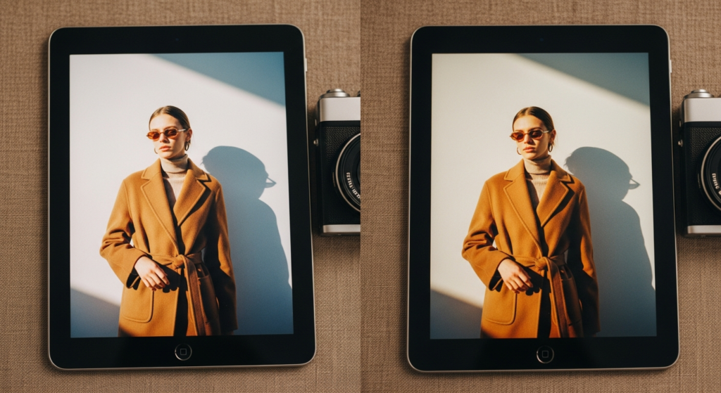
5. The Golden Hour Glow Enhancement Tutorial
The golden hour glow photo editing tutorial amplifies and enhances the most beautiful natural light available — the warm, honey-toned, low-angled light of the hour after sunrise and the hour before sunset. When captured and carefully enhanced through deliberate editing, golden hour light creates fashion images of extraordinary, painterly beauty.
Styling Tip for the Edit: Begin by warming the overall temperature significantly — increase by 300 to 600 units depending on the original image’s temperature. Shift the tint slightly toward magenta. In the HSL panel, raise the saturation and luminance of oranges and yellows specifically — this enhances the warmth of the skin tone and the golden quality of the light without affecting other colour areas. Increase vibrance rather than overall saturation for a more natural, glowing result. Apply a warm vignette — slightly darkening the edges with an orange-brown colour rather than pure black — to create the enveloping, golden warmth that defines the best golden hour fashion photography.

6. The Cool Toned High Fashion Tutorial
The cool toned high fashion photo editing tutorial is the aesthetic choice of luxury fashion brands, premium beauty campaigns, and the most directional editorial photography — clean, slightly blue-toned, precisely desaturated, and possessed of a cool, authoritative sophistication that removes warmth and distraction in favour of absolute visual precision.
Styling Tip for the Edit: Shift the white balance toward the cool end — reduce temperature by 200 to 400 units for the characteristic cool editorial cast. In the HSL panel, reduce the saturation of all warm tones — oranges significantly, reds moderately, yellows slightly — while allowing blues and teals to retain or slightly increase their richness. Raise clarity by five to ten points for sharpness and definition — the cool high fashion edit is sharper and more precise than any other style. Reduce highlights and raise shadows slightly for a more even tonal distribution. The overall quality should feel clean, cool, and precisely controlled without appearing cold, harsh, or clinical.
7. The Airy Pastel Dreamscape Tutorial
The airy pastel dreamscape photo editing tutorial is the editing aesthetic of feminine fashion content, soft beauty photography, and the most delicate corner of the lifestyle photography world — characterised by cloud-like lightness, pastel-tinted highlights, reduced contrast, and a dreamy, ethereal quality that makes images appear to exist in a particularly beautiful moment of light.
Styling Tip for the Edit: Begin by raising exposure and whites significantly — this edit requires genuine brightness, not the artificial appearance of brightness with retained shadow depth. Reduce blacks significantly to eliminate deep shadows. In the colour grading panel, add a soft pastel tint to highlights — blush pink, pale lavender, or soft mint — by reducing the luminance of the highlight channel and introducing a gentle hue shift toward the desired pastel tone. Reduce saturation moderately across all colour channels and raise the fade using the tone curve. The result should feel luminous, soft, and genuinely light — nothing should appear heavy, dark, or fully saturated.
8. The Vintage Faded Analogue Tutorial
The vintage faded analogue photo editing tutorial borrows its visual language from aged photographic prints, analogue instant cameras, and the beautiful imperfection of images found in fashion archives and vintage editorial collections. It creates a quality of nostalgic authenticity that no other editing style replicates — each image appears as though it has lived a little before being seen.
Styling Tip for the Edit: Apply a strong fade using both the tone curve and a dedicated fade slider — lifting blacks significantly more aggressively than the soft matte edit. In the colour grading tool, introduce a warm yellow-orange cast in mid-tones and a distinctly cool or slightly green cast in shadows for authentic vintage colour separation — this two-tone shadow-to-highlight colour split is the defining characteristic of genuine vintage photographic colour quality. Reduce overall saturation dramatically — vintage photographs are defined by muted, faded colour rather than richness. Add heavy grain at twenty-five to forty percent with large grain size for the most authentic analogue texture.
9. The Dark Earth Tone Fashion Tutorial
The dark earth tone photo editing tutorial creates the most organic and most season-specific fashion photography aesthetic — an editing approach that deepens warm earth tones, desaturates cool tones, and creates an image palette defined entirely by the richness of the natural world. It is the editing style of slow fashion, artisan content, and warm, considered aesthetic photography.
Styling Tip for the Edit: In the HSL panel, raise the saturation and slightly reduce the luminance of oranges, reds, and yellows — deepening and enriching the warm earth tones within the image. Simultaneously, reduce the saturation of blues, greens, and purples significantly to desaturate any cool areas. Warm the overall temperature and shift the tint slightly toward orange. In the colour grading panel, add a warm amber tone to shadows and a slightly lighter warm tone to highlights for a fully cohesive, warm-world colour story. Reduce clarity slightly for a more organic, textural quality.
This photo editing tutorial look works most powerfully for fashion photography featuring warm-toned outfits and warm, natural environments — terracotta, camel, rust, linen, and leather all become more richly beautiful under this edit.
10. The Black and White Fine Art Tutorial
The black and white fine art photo editing tutorial elevates any fashion photograph with a timeless, emotionally resonant quality — monochrome images carry an authority, a depth, and an aesthetic power that colour photography cannot always achieve. Executed with genuine craft, a black and white fashion edit communicates artistry and intentionality at the highest level.
Styling Tip for the Edit: Never simply desaturate an image for a black and white conversion — use the colour mix panel in your black and white conversion tool to control how each individual colour converts to grey. Lighten reds and oranges to warm and brighten skin tones. Darken blues and greens to add depth to backgrounds and environments. Raise contrast moderately for definition and visual impact — a flat, low-contrast black and white image lacks the drama that makes monochrome fashion photography most compelling. Add a very slight warm tone — approximately five to ten units toward yellow-brown — to the finished black and white image for a beautiful, warm monochrome quality that prevents the image from appearing cold or clinical.
11. The Skin Luminosity Enhancement Tutorial
The skin luminosity photo editing tutorial is the most technically essential and the most practically valuable of all fashion photography editing techniques — it centres on achieving the most naturally beautiful, most luminous, and most flattering skin tone representation while maintaining the full integrity and authenticity of the image. It is the edit that makes the difference between a good fashion photograph and a great one.
Styling Tip for the Edit: In the HSL panel, focus specifically on the orange channel — the colour that most directly corresponds to skin tone in most photographs. Raise the orange luminance by five to fifteen points to brighten and illuminate skin tones without affecting other elements in the frame. Simultaneously, reduce the orange saturation very slightly — by two to five points — to prevent skin tones from appearing oversaturated or unnatural. Add a small amount of warmth to the temperature slider — approximately 100 to 150 units — for a natural skin warmth. Apply a gentle soften skin effect using a masking or targeted adjustment brush set to negative clarity of approximately minus twenty to minus thirty.
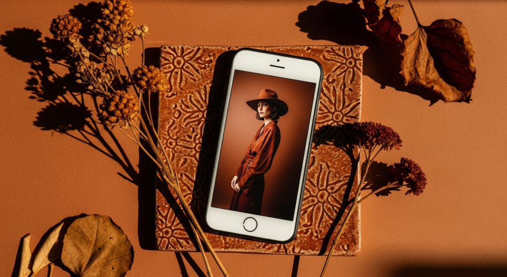
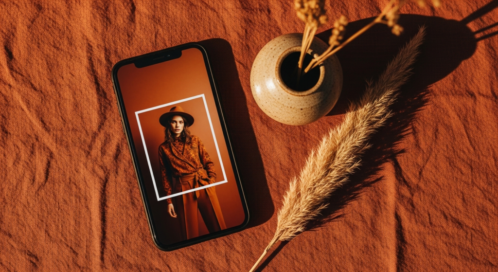
12. The Terracotta and Warm Tonal Fashion Tutorial
The terracotta and warm tonal photo editing tutorial is the most specifically seasonal and the most immediately recognisable of all the fashion photography editing aesthetics — a distinctive, warm-world look that saturates earthy orange and red tones while reducing cool colours to create an image defined entirely by the palette of warm earth, autumn light, and natural warmth.
Styling Tip for the Edit: In the HSL panel, significantly raise the saturation of oranges and reds — this is the primary and most impactful adjustment of this entire tutorial. Simultaneously reduce blues and greens to near-zero saturation to remove any cool tones from the image entirely. Warm the temperature dramatically — by 400 to 700 units depending on the original — and shift the tint toward orange. In colour grading, add warm orange tones to both shadows and highlights, with the shadow tone slightly deeper and the highlight tone slightly lighter for warmth without flatness. The result should feel like the entire image is bathed in warm, terracotta-toned light from within.
13. The Hyper-Minimal True Colour Tutorial
The hyper-minimal true colour photo editing tutorial is the most technically demanding and the most philosophically pure of all the editing approaches on this list — it involves the smallest possible number of deliberate adjustments, seeking only to correct rather than transform, and to present the image in the most honest and the most beautiful version of what the camera actually captured.
Styling Tip for the Edit: Begin with a precise white balance correction — the most accurate rendering of the actual colour of the light in the scene, neither warmed nor cooled beyond what was genuinely present. Adjust exposure to the precise optimum level for the specific subject. Raise shadows by five to ten points to open detail without flattening. Apply a single, barely perceptible S-curve in the tone curve — raising highlights by two to three points and deepening shadows by two to three points — for a gentle increase in contrast and depth. Add zero grain, zero vignette, zero colour grading, and zero clarity adjustment. The resulting edit should appear entirely natural — as though no edit has been applied — while actually being a precisely and carefully considered improvement on the original capture.
This tutorial is the most important of all thirteen — it teaches the discipline of restraint that makes all other editing more precise, more beautiful, and more genuinely effective.
Conclusion
Photo editing is the final, essential act of vision in fashion photography — the moment where technical capture is transformed into genuine aesthetic expression and where a photograph becomes truly, lastingly worth seeing. The thirteen photo editing tutorial looks explored here represent the full spectrum of what deliberate, considered editing can achieve — from the warm nostalgia of film tones and the dramatic depth of dark cinematic editing to the luminous simplicity of the clean bright look and the philosophical restraint of the hyper-minimal approach.
The most important principle across all thirteen tutorials is the same — editing should serve the image and the visual story it is trying to tell, never simply demonstrating technical capability or following a trend. The edit that makes a photograph most beautiful is always the one that most clearly and most honestly expresses the specific vision of the specific moment it was made to honour.
Choose the tutorials that resonate most deeply with your visual identity. Practice them with patience and genuine curiosity. And trust that consistent, considered, intentional editing is the single most powerful investment you can make in the beauty and the impact of your fashion photography.
FAQs
Q1: What are the most popular photo editing tutorial styles for fashion photography in 2025? The most popular photo editing tutorial styles for fashion photography in 2025 include the warm film tone, the clean bright editorial, the soft matte fade, the golden hour glow enhancement, the cool toned high fashion look, and the dark earth tone fashion edit. These styles consistently generate the highest engagement and the most saves on fashion photography platforms for their combination of genuinely beautiful results and clearly achievable techniques.
Q2: What software is best for fashion photo editing tutorials? Adobe Lightroom is the most widely used and the most capable software for fashion photo editing tutorials — its comprehensive tone curve, HSL panel, colour grading tools, and masking capabilities provide precise control over every element of the edit. Lightroom Mobile offers professional-level control in a mobile app format for those editing on phones or tablets. VSCO provides excellent preset-based editing for quicker, less technical workflows. Capture One is preferred by professional fashion and studio photographers for its exceptional colour rendering and tethered shooting capabilities.
Q3: How do I create a consistent photo editing style for fashion content? Creating a consistent editing style for fashion content requires developing a custom preset — a saved set of starting adjustments that you apply to every image before making image-specific corrections. Your preset should define your signature tone, colour palette, contrast level, grain quality, and overall mood. Apply the preset as a consistent starting point across every image, then adjust for the specific requirements of each individual photograph while maintaining the overall aesthetic signature. The consistency of the preset, combined with the flexibility of image-specific adjustment, creates the most professional and most recognisable fashion photography editing style.
Q4: How much should I edit fashion photos for social media? The most admired and the most enduringly popular fashion photography on social media consistently demonstrates editing that enhances rather than transforms the original image — where the edit feels like the most beautiful possible expression of the real moment rather than a digitally manufactured alternative to it. Heavy-handed skin retouching, unrealistic colour shifts, and over-processed clarity all reduce the authenticity and the credibility of fashion photography in the eyes of increasingly discerning audiences. The general principle for social media fashion photo editing is to apply as much editing as necessary to achieve the desired look, and as little as possible beyond that.
Q5: Can I achieve professional photo editing tutorial looks on a mobile phone? Many of the photo editing tutorial looks described in this guide can be achieved to a high standard on mobile using Lightroom Mobile, VSCO, or A Color Story. Lightroom Mobile offers the most complete professional tool set — including tone curves, colour grading, HSL panels, and masking — for mobile editing of comparable quality to desktop software. For the most technically complex and the most precise editing approaches — the hyper-minimal true colour tutorial and the cool toned high fashion look in particular — desktop editing software with a calibrated colour monitor delivers the most accurate and the most professional results. For everyday fashion content creation, however, mobile editing tools are entirely capable of achieving beautiful, consistent, and professional results.